
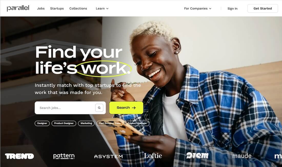
A landing page is not art. It is a machine with one job: turn the right visitor into a lead, signup, or sale.
I have shipped landing pages for SA startups, custom software development offers, and app waitlists. The pages that convert share a process, not a template fad.
This guide walks through that process: research, message, structure, landing page development choices, launch, and iteration. Use it yourself or hand it to an app development company in South Africa so you know what "done" looks like.
If you need the definition first, read what is a landing page.
Step 1: Define one conversion goal
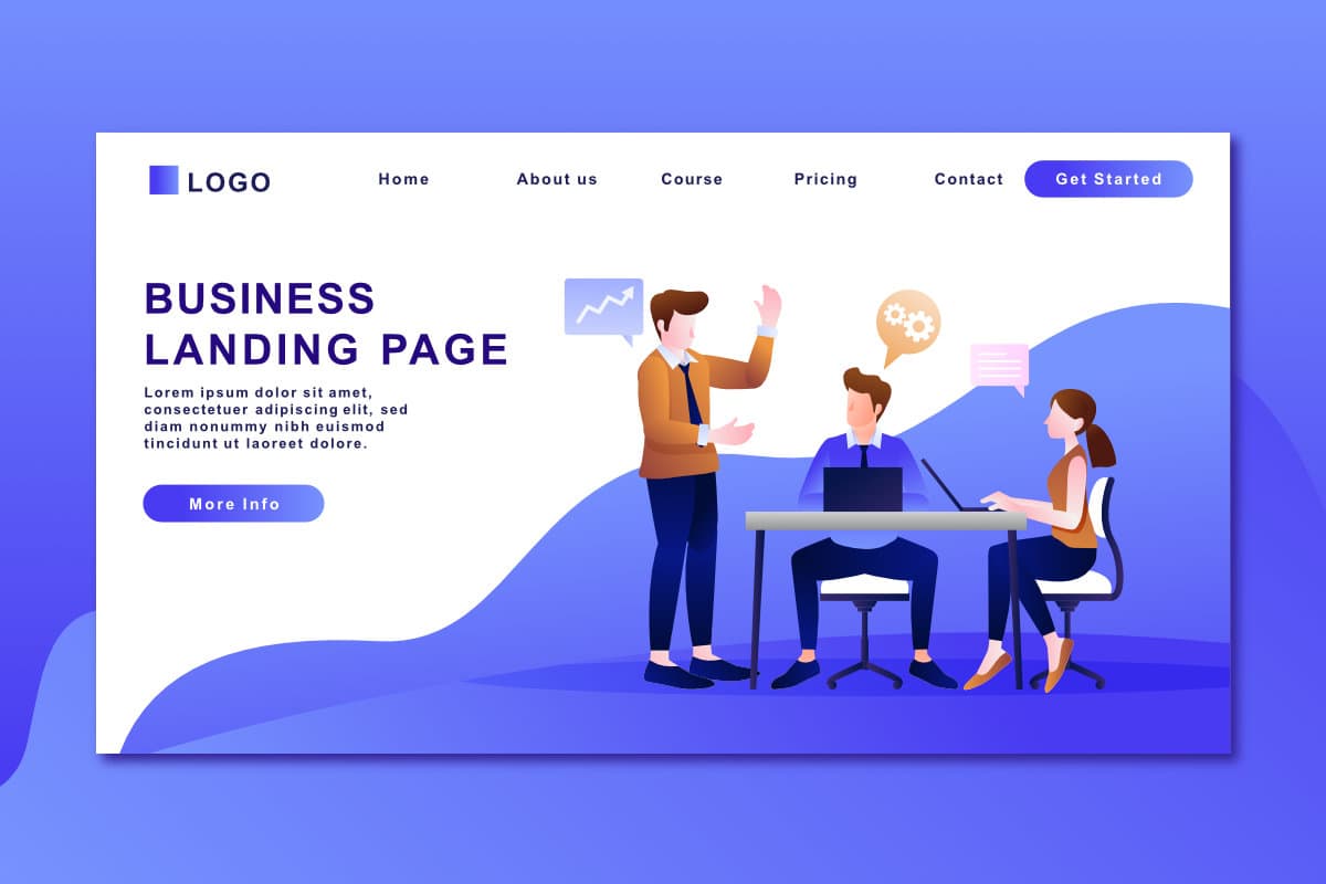
Pick one primary action per page:
- Submit a lead form
- Book a call
- Start WhatsApp chat
- Buy one SKU
- Join waitlist
- Download a PDF
Everything on the page supports that action. Secondary links (privacy, terms, "about") stay in the footer, not the hero.
Write the goal as a measurable event: lead_form_submit, whatsapp_click, checkout_start. If you cannot name the event, you are not ready to design.
Step 2: Know who lands and why
Traffic sources change intent:
| Source | Visitor mindset | Page must |
|---|---|---|
| Google search | Problem-aware, comparing | Match keyword intent, fast proof |
| Meta / TikTok ad | Curiosity, scroll-trained | Hook in 2 seconds, visual clarity |
| Warmer, knows you | Reinforce offer, reduce friction | |
| Referral | Trust transfer | Highlight referrer story or segment |
For SA campaigns, note city, language preference, and device. Mobile dominates. Desktop admin users are not your ad audience.
Interview five people in your ICP (ideal customer profile) if you can. Ask what would make them not fill in the form. Objections become FAQ sections.
Step 3: Research the message (before pixels)
Outcome headline
Lead with the result, not the feature list.
Weak: "AI-powered platform for synergy."
Strong: "Book clinic slots for your mining site without phone tag."
Proof you can defend
Metrics, client logos, screenshots, star ratings, compliance badges. Do not invent numbers. Use real pilots or narrow claims ("Used on three Eastern Cape sites") until you have scale proof.
Offer clarity
What they get, when, and what it costs (or "from R..." for scoped services).
Risk reversal
Guarantees, free audits, "no card required," clear POPIA statement on data use.
Step 4: Map the page structure
A high-converting layout usually flows like this:
- Hero: headline, subhead, primary CTA, optional short visual
- Social proof strip: logos or one strong testimonial
- Problem → solution: three pains, three responses
- How it works: 3 steps max
- Deep proof: case study, screenshot, video
- Offer stack: what is included
- FAQ: top five objections
- Final CTA block: repeat button, WhatsApp option
- Footer: legal, contact, minimal nav
For long-scroll pages, repeat the CTA after proof blocks. Sticky mobile CTA bars help when the page is tall.
Do not add a blog sidebar. Do not add unrelated product grids.
Copy formulas that work on SA B2B pages
You do not need magic words. You need structure.
Headline formula: [Outcome] + [for whom] + [without pain]
Example: "Ship a Paystack-ready MVP for your marketplace without hiring a full dev team."
Subhead formula: [How] + [proof hint] + [time or scope anchor]
Example: "Senior-led Phase 1 delivery from Queenstown, fixed scope, 6–10 weeks for a single-app loop."
CTA formula: [Verb] + [specific next artifact]
Example: "Get my ballpark quote" beats "Contact us."
FAQ formula: turn sales objections into questions
- "Why is this more than a freelancer quote?"
- "Do I own the code and accounts?"
- "What if I already burned money on a junior build?"
Step 5: Write copy for scanning
People skim on phones.
- Headlines: 6–12 words, specific
- Subheads: one idea each
- Bullets: parallel grammar, outcome-led
- Buttons: verb + outcome ("Get my quote," not "Submit")
- Avoid jargon unless your ICP uses it daily
Voice should sound like a person, not a press release. Follow your brand rules: direct, no filler, no fake urgency.
Pair landing copy with your main site story. If you promise technical co-founder delivery, the page should not sound like a generic agency.
Step 6: Design for trust and clarity
Visual hierarchy
One focal point in the hero. Contrast on the primary button. Plenty of whitespace on mobile.
Real photography
Stock photos of handshake meetings age badly. Product UI, team photos, or customer context win.
Accessibility
WCAG (Web Content Accessibility Guidelines) AA contrast, visible focus rings, labels on inputs, error text that helps fix the problem.
Motion
Subtle entrance animations are fine. Respect prefers-reduced-motion. Never block the CTA behind a slow loader.
Step 7: Choose the tech stack for landing page development
When static or no-code is enough
- Short-lived campaign
- No custom auth or dynamic pricing
- Marketer will duplicate the page themselves
Tools: Webflow, Framer, hosted HTML. Host on Netlify or Vercel (platform comparison).
When custom code is worth it
- Shared design system with your React app
- Dynamic content from CMS or API
- A/B tests wired to feature flags
- Complex forms (multi-step, file upload, validation rules)
- Integration with product signup and analytics you already run
Custom software development teams often use Next.js or Vite + React so the landing page becomes the marketing shell around the app you will ship next.
An app development company in South Africa should tell you which path avoids a throwaway rebuild in six months.
Step 8: Build for performance (non-negotiable in SA)
Slow pages tax conversion and ad spend.
- Compress images (WebP/AVIF), responsive
srcset - Limit third-party scripts (chat widgets, trackers)
- Font subsetting, preconnect to CDN
- Target strong LCP (Largest Contentful Paint) on mid-tier Android over 3G
- Test on real devices, not only office Wi-Fi
Step 9: Forms and WhatsApp that actually convert
Forms
- Ask only what sales needs (name, email, company, one free text)
- Use appropriate input types (
tel,email) - Inline validation, clear errors
- Success state with next step ("We reply within one business day")
- POPIA: purpose statement + link to privacy policy
WhatsApp CTA
Many SA buyers prefer chat. Use a prefilled message link: wa.me/27603116777. Track clicks separately from form submits.
Offering both paths beats forcing one channel.
Step 10: Wire analytics and tags
Minimum setup:
- Page views and CTA clicks (GA4 or privacy-friendly alternative)
- UTM discipline on every ad link
- Thank-you page or event for conversions
- Meta / Google pixels only if you use those channels (and understand consent)
Build a simple dashboard: spend, visits, leads, cost per lead, qualified rate from sales.
Without numbers, you are guessing which headline wins.
Step 11: SEO basics (even for paid-first pages)
- Unique
titleand meta description (under ~60 / ~155 characters) - One H1 matching intent
- Descriptive URL slug (
/solutions/marketplace-founders-south-africastyle on programmatic pages) - Open Graph image for shares
- Internal links to deeper content (services, relevant solutions)
Paid traffic can run without SEO. Organic and partner shares still benefit.
Step 12: Staging review checklist
Before launch, walk through:
- Mobile Safari and Chrome Android
- Form submits reach inbox or CRM
- WhatsApp opens correct thread
- Thank-you / conversion events fire
- Spelling and ZAR formatting
- 404 on broken assets
- SSL (HTTPS) active
- Favicon and OG image present
Record a two-minute Loom for stakeholders. Async approval beats surprise launch day fights.
Step 13: Launch with controlled traffic
Do not blast full budget day one.
- Soft launch to email list or small geo
- Fix obvious bugs
- Scale ad spend while watching cost per lead
- Pause if message mismatch (high bounce, zero leads)
Compare weeks, not hours. Weekends and payday cycles move SA B2B and consumer behavior.
Step 14: Iterate with discipline
Change one major variable per experiment:
- Headline angle (save time vs make money)
- Hero visual (product vs human)
- Form length
- CTA label
- Proof placement (above vs below fold)
Run until you have enough volume for a decision. Low traffic needs longer runtimes or bolder changes.
Document winners in the brief so dev and marketing stay aligned.
Step 15: Connect the landing page to product
High conversion on a lie is worse than low conversion on truth.
If the page promises an app feature you have not built, you burn trust and support time. Sequence honestly:
- Landing page validates message and leads
- Scope Phase 1 MVP with fixed deliverables
- Ship product that matches the page
- Point retargeting ads at onboarding, not fake screenshots
Marketplace and SaaS founders often keep campaign pages live while engineering catches up. Flag "beta" or "waitlist" when appropriate.
Landing page development with an app roadmap
When you hire for landing page development plus app work, specify:
| Deliverable | Include |
|---|---|
| Design | Mobile-first Figma or coded components |
| Build | Production deploy, env vars documented |
| Integrations | CRM, email, analytics, WhatsApp |
| Performance | Budget for image/CDN (Content Delivery Network) |
| Handoff | Repo access, content edit path |
| Phase 2 | Shared tokens/components for app |
Indicative SA bands for senior-led landing builds often sit around R90,000–R140,000 when done properly (see co-founder cost guide). Cheaper quotes that skip analytics, accessibility, and integration usually cost more later.
Common failure patterns I see
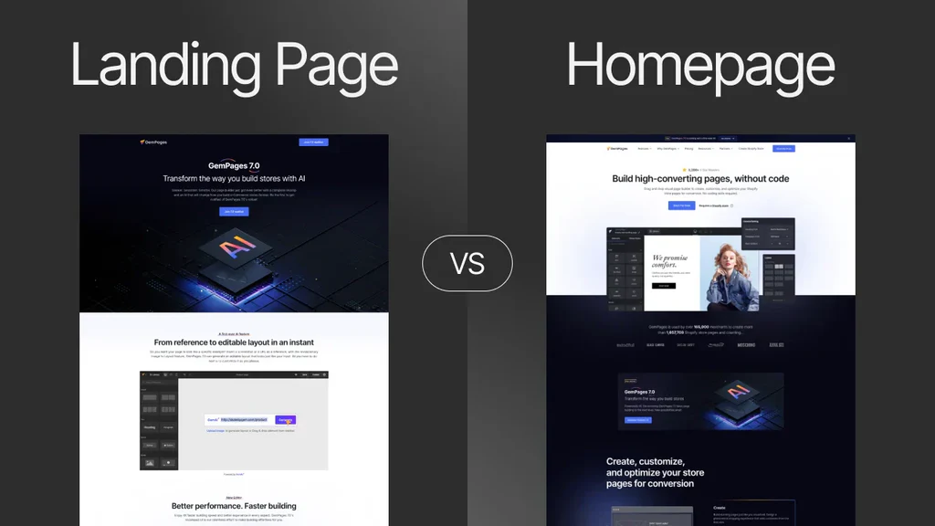
- Homepage as landing page: menu maze kills ad intent
- Clever headline, vague offer: clicks without leads
- Desktop-first design: CTA below the fold on mobile
- No proof: strangers will not trust you
- Ten-field form: fear before value
- Tracking broken: team argues opinions for months
- Mismatch with sales: leads are unqualified because copy targeted everyone
Tools that help (without replacing thinking)
| Job | Examples | Notes |
|---|---|---|
| Wireframe | Figma, Excalidraw | Block sections before visual polish |
| Copy | Notion brief, shared doc | Version headlines with dates |
| Build | Next.js, Vite, Webflow | Match long-term product stack |
| Heatmaps | Hotjar, Microsoft Clarity | Privacy policy and consent first |
| A/B test | VWO, Google Optimize alternatives, feature flags | Need traffic volume |
| Speed | PageSpeed Insights, WebPageTest | Test on mobile throttling |
| Forms | Tally, Typeform, custom React | CRM webhook on submit |
Tools do not fix weak offers. They make good offers easier to improve.
Legal and trust footer (South Africa)
Add a lightweight footer block:
- Company name and registration if applicable
- Physical or service area clarity
- Link to privacy policy
- POPIA-aligned consent on forms ("We use your details to respond to this enquiry")
For health, finance, or children's data, get proper legal review. A landing page is still processing personal information.
Best practices summary
- One goal, one primary CTA
- Message match with ad and search intent
- Mobile speed and clarity first
- Proof near the first CTA
- Short forms plus WhatsApp option
- Measure events, iterate one change at a time
- Align promises with what engineering can ship
- Own your domain, repo, and analytics accounts
Frequently asked questions
How long should landing page development take?
A focused senior build often takes 2–4 weeks including copy rounds, integrations, and QA. Complex dynamic pages take longer. "Two days" usually means template with no strategy.
What is a good conversion rate?
Depends on industry and traffic temperature. B2B lead gen might celebrate 5–15% from warm traffic. Cold ads might be 1–3%. Track trend, not blog benchmarks.
Should I use a template?
Templates jump-start layout. Custom value is in message, proof, speed, and integrations. Pure templates struggle when you look like every competitor.
When do I need custom software after the page?
When leads expect a product experience: accounts, payments, dashboards. That is Phase 1 app work, not more landing page tweaks forever.
What to do next
- Complete Steps 1–3 on paper (goal, audience, brief).
- Ship a v1 page this sprint, even if ugly, with tracking live.
- Send modest traffic, read the data, iterate.
- When leads prove demand, get a quote for landing plus app scope with one team so design and product stay consistent.
A high-converting landing page is a loop: promise, proof, action, measurement, learning. Build the loop on purpose.
Want landing page development that connects to a real app build? Get a project quote or WhatsApp me.
#LandingPage #CRO #Conversion #SouthAfrica #WebDevelopment #CustomSoftware #ProductEngineering